The One-Page Marketing Plan That Cuts Your Workload in Half
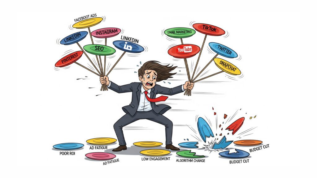
“The ability to simplify means to eliminate the unnecessary so that the necessary may speak.” – Hans Hofmann Stop Drowning in Your Own Marketing Strategy Picture this: It’s 2 AM, and you’re hunched over your laptop, squinting at a 47-page marketing plan that reads like a NASA launch manual. You’ve got seventeen different social media platforms to manage, twelve email sequences to optimize, and somewhere in the chaos, you’ve lost track of whether you’re supposed to be building a TikTok following or launching a podcast. Sound familiar? Welcome to the marketing overwhelm epidemic—where business owners have become digital plate-spinners, frantically trying to keep every marketing channel spinning while their actual business slowly suffocates under the weight of their own “comprehensive strategy.” Here’s the kicker: Your marketing plan is probably killing your marketing results. Why Your Complex Marketing Plan is Actually Sabotaging You Let’s get brutally honest for a hot minute. That beautiful, color-coded, multi-platform marketing masterpiece sitting in your Google Drive? It’s not helping you. It’s hurting you. Here’s why complex marketing plans fail faster than a paper airplane in a hurricane: Decision fatigue is real, and it’s vicious. When you wake up to 47 different marketing tasks, your brain immediately goes into shutdown mode. Should you write that blog post, respond to Instagram comments, update your LinkedIn, or optimize your Facebook ads? By the time you’ve decided, it’s lunch time and you’ve accomplished exactly nothing. Resource dilution is a silent killer. Trying to be everywhere means you’re nowhere effectively. You end up being that person who posts sporadically on eight platforms instead of dominating one or two. Execution becomes impossible. Complex plans look impressive in meetings, but they crumble under real-world pressure. When life gets busy (and it always does), your 23-step marketing funnel becomes a 23-step nightmare. The dirty little secret? Most marketing “experts” overcomplicate things because complexity feels impressive. But here’s what actually works: relentless focus on what moves the needle. The One-Page Revolution: Why Less is Exponentially More “The ability to simplify means to eliminate the unnecessary so that the necessary may speak.” – Hans Hofmann What if I told you that every successful business has one thing in common? They do a few things incredibly well instead of doing everything mediocrely. The one-page marketing plan isn’t about being lazy—it’s about being laser-focused. It’s about cutting through the noise and identifying the 20% of activities that drive 80% of your results. Here’s the beautiful truth: Clarity creates momentum. When you can see your entire marketing strategy on one piece of paper, your brain can actually process it. You can spot gaps instantly, make decisions quickly, and—here’s the magic—you can actually execute it consistently. Your One-Page Marketing Plan Blueprint Ready to build yours? Grab a piece of paper (yes, actual paper) and let’s create something beautiful. The Top Third: Your Foundation Start with these three non-negotiables: Your One Perfect Customer Forget demographics and buyer personas that read like FBI profiles. Pick one real person. Give them a name. What keeps them awake at 3 AM? What makes them reach for their credit card? If you can’t describe your customer like you’re talking about your best friend, you’re still too vague. Your One Compelling Promise What’s the one thing you do that makes people say “Where have you been all my life?” Not three things. Not five things. One thing that makes you irreplaceable. Your One Big Goal Pick one number that matters. Revenue, new customers, email subscribers—whatever moves your business forward. Everything else is just noise. The Middle Third: Your Strategy Now for the meat and potatoes: Your Primary Channel: This is your marketing home base. The place where you’ll invest 70% of your time and energy. Choose based on where your customers actually hang out, not where you think they should be. Your Secondary Channel: This is your backup singer—important but not the star. Allocate 30% of your efforts here. Your Content Themes: Pick 2-3 messages you’ll hammer home consistently. Repetition isn’t boring; it’s branding. The Bottom Third: Your Execution This is where dreams meet reality: Weekly Actions: List 3-5 specific tasks you’ll do every single week. No exceptions, no excuses. Monthly Checkpoints: Schedule time to review what’s working and what’s not. Success Metrics: Choose 1-3 numbers you’ll track religiously. The Magic Happens in What You DON’T Do Here’s where most people mess up: they think the one-page plan means doing less work. Wrong. It means doing less types of work so you can do more of the right work. Your one-page plan is like Marie Kondo for your marketing—if it doesn’t spark joy (or sales), it doesn’t belong. The Elimination Rules: If it’s not on the page, you don’t do it If it doesn’t directly support your one big goal, it gets cut If you can’t do it consistently, it’s not sustainable “It is not a daily increase, but a daily decrease. Hack away at the inessential.” – Bruce Lee Real Results from Real Businesses Sarah, a business coach, was posting on Instagram, LinkedIn, Twitter, Facebook, running Google Ads, doing webinars, and sending three different email newsletters. She was exhausted and her revenue was flat. Her one-page plan? Focus on LinkedIn content and email marketing. That’s it. Result? She doubled her client base in six months while working 15 fewer hours per week on marketing. Why? Because she finally got good at two things instead of being mediocre at eight. Your Quick Start Action Plan Today (5 minutes): Grab that overwhelming marketing plan and highlight only the activities that directly led to sales in the last 90 days. Everything else gets deleted. This Week: Create your one-page plan using the blueprint above. Yes, it feels scary to let go of all those “might work” strategies. Do it anyway. This Month: Execute only what’s on your page. Fight the urge to add “just one more thing.” Trust the process. The Bottom Line Your marketing plan should fit on one page because your customers’ attention spans
The Ugly Truth About Your Website’s Abandonment Rate

Let’s cut the pleasantries, shall we? You’ve got a website. You’re pouring time, effort, and probably a decent chunk of change into getting people to visit it. But here’s the gut punch: are they staying? Or are they arriving, taking one look, and hitting the digital eject button faster than a teenager spotting their parents at the mall? If you’re honest, you probably suspect the latter. And you’re not alone. The vast majority of websites are digital sieves, leaking potential customers and profits like a rusty old colander. We’re talking about an abandonment rate, my friend, and it’s the silent killer of online dreams. Part I. Diagnosing the Problem: Where Are Your Visitors Going (or Not Going)? Before you can fix what’s wrong, you need to stare the ugly truth square in the face. This isn’t about guessing; it’s about cold, hard data. It’s about understanding why your website, despite all your efforts, might be actively repelling the very people you’re trying to attract. Think of your website as a physical storefront. Imagine people walking in, looking around for a split second, scowling, and then storming right back out. You’d be frantic, right? You’d be tearing your hair out trying to figure out what just happened. Yet, online, we often ignore the digital equivalent, hoping it just… goes away. It doesn’t. It just quietly siphons off your hard-earned traffic and turns it into nothing. B. Engagement Gaps: Are Visitors Sticking Around? So, they found you. Great. The first hurdle is cleared. But here’s the kicker: are they sticking around? This is where the real work begins. If your visitors are bouncing off your pages faster than a rubber ball in a small room, something is fundamentally broken. Something is actively turning them away, often before they even have a chance to see the true value you offer. Let’s rip off the band-aid and expose the most common culprits behind these engagement gaps. These aren’t minor annoyances; these are profit-eating monsters: High Bounce Rate: The Instant Rejection. This is the ultimate slap in the face. Someone lands on your page and leaves immediately. We’re talking seconds. It’s like they walked into your store, saw something they hated, and bolted. This screams, “I’m not interested! You didn’t give me what I wanted!” Is your content a mismatch for their search? Is the page confusing? Is it just plain ugly? A high bounce rate is a flashing red light screaming, “Houston, we have a problem!” Short Time on Page: The Drive-By Glance. They stayed a little longer than the bouncers, but not by much. Maybe 10 seconds, 20 seconds. Enough time to skim a headline, maybe a sentence or two, and then… poof. They’re gone. This tells you they found your page, but your content didn’t grab them, didn’t hold their interest, or didn’t deliver on the promise of the headline. You’re not giving them a reason to dig deeper, to invest their precious time. Confusing Navigation: The Lost Tourist. Imagine walking into a massive airport with no signs, no maps, and no one to ask for directions. That’s what a confusing website feels like. If your visitors can’t easily find what they’re looking for – your products, your services, that crucial piece of information – they won’t spend time playing detective. They’ll get frustrated, give up, and find a competitor whose site actually makes sense. Every click should lead them closer to their goal, not into a digital maze. Slow Loading Speeds: The Impatient Customer. In today’s instant-gratification world, patience is a forgotten virtue. People expect things to load now. Every second your page takes to load after 2-3 seconds is a second you’re bleeding visitors. Studies consistently show that even a one-second delay can lead to a significant drop in conversions. Think about it: how long do you wait for a slow website? Not long, right? Neither do your potential customers. Poor Mobile Responsiveness: The Tiny Type Nightmare. More people are accessing the internet on their phones than ever before. If your site looks terrible, is impossible to navigate, or requires endless pinching and zooming on a mobile device, you’re essentially slamming the door in the face of a huge chunk of your audience. This isn’t a “nice-to-have” anymore; it’s a fundamental requirement. If your site isn’t mobile-friendly, it’s mobile-hostile. Unengaging or Irrelevant Content: The Mismatched Date. You might be getting traffic, but is your content actually speaking to your audience’s deepest desires, fears, and needs? If your words are bland, generic, or completely off-topic from what they expected, they’ll peace out faster than you can say “conversion rate.” Your content needs to be compelling, problem-solving, and directly relevant to the reason they landed on your page in the first place. You need to hit them where they live. Broken Links or Technical Errors: The Glitch in the Matrix. Nothing screams “unprofessional” and “don’t trust us” more than broken links, missing images, or 404 errors. These are the digital equivalent of a faulty product or a storefront with a boarded-up window. They immediately erode trust and send visitors running for the hills. A well-maintained site is a sign of a well-run business. Outdated or Unprofessional Design: The Shabby Appearance. First impressions matter. A dated, cluttered, or amateurish website design can instantly turn off visitors, making them question your credibility and professionalism. If your site looks like it was built in 2005 and hasn’t been touched since, people will assume your business practices are equally stagnant. Design isn’t just about aesthetics; it’s about conveying trustworthiness and competence. Too Many Distractions: The Sensory Overload. Pop-ups. Autoplaying videos. Excessive ads. Cluttered layouts. These aren’t engaging; they’re overwhelming. They create a frustrating user experience that makes it impossible for visitors to focus on what truly matters: your message. When your site screams for attention from every corner, it ultimately gets none. Simplicity often trumps complexity when it comes to guiding your visitor. Lack of Clear Next Steps: The Dead End. So, they read your
Fatal Flaws: Why Your “Set It & Forget It” Website is Failing You

Let’s be honest. In this wild, digital jungle we call the internet, too many folks treat their website like a shiny new appliance. They unbox it, plug it in, admire it for a minute, and then… poof! It vanishes from their daily thoughts, gathering digital dust in the far corners of their mind. “Set it and forget it,” they whisper, a dangerous mantra that leads to a slow, painful digital death. But here’s the cold, hard truth, laid bare for all to see: Your website isn’t a toaster. It’s not some static, lifeless brochure you print once and then toss into a drawer. Oh no, my friend. Your website is a pulsating, breathing, ever-evolving beast. It’s a living, breathing asset that demands your constant attention, your gentle nudges, and yes, sometimes, your firm hand. Ignore it, and it will wither. Nurture it, and it will blossom into a relentless sales machine. So, if you’ve been caught in the “set it and forget it” trap, consider this your wake-up call. Because the world of online business moves faster than a greased lightning bolt, and if you’re standing still, you’re not just falling behind – you’re digging your own digital grave. The Blindfold Effect: Why You Can’t Fly Solo Without Analytics Imagine trying to navigate a dense fog without a compass, without a map, without even the faintest glimmer of light. Sounds terrifying, right? That’s exactly what you’re doing if you don’t have analytics humming in the background of your website from day one. You need to know who’s showing up to your digital doorstep. Are they lingering? Are they bouncing faster than a rubber ball on concrete? Are they finding what they’re looking for? Are they actually buying something? Without tools like Google Analytics, you’re flying blind, making decisions based on hunches and hope, which, in business, is a recipe for disaster. So, set up analytics from day one. It’s your digital compass, your flashlight in the fog, your early warning system. The Metrics That Matter: Don’t Get Lost in the Data Swamp Once you’ve got your analytics humming, don’t fall into the trap of staring at every single number like it’s a cryptic treasure map. Not all data is created equal. You need to identify Key Performance Indicators (KPIs) that truly matter for your bottom line. Forget the vanity metrics that make you feel good but don’t put money in your pocket. Focus on the gritty, real-world numbers: your conversion rate (are people actually buying?), your traffic sources (where are your best customers coming from?), time on page (are they engaged?), and bounce rate (are they running away screaming?). These are the vital signs of your website, the pulse that tells you if your digital heart is beating strong or faltering. The Ritual of Review: Your Weekly Date with Destiny Here’s a secret weapon of highly successful online entrepreneurs: they make regularly reviewing their data a non-negotiable ritual. This isn’t a once-a-year tax season headache. This is a weekly or monthly rendezvous with your website’s soul. It’s where you track your progress, celebrate small victories, spot emerging problems before they become full-blown catastrophes, and uncover golden opportunities you never knew existed. Think of it as a doctor’s check-up for your digital health. You wouldn’t skip those, would you? The Whispers of Your Customers: Listen Up, Buttercup! Your customers are practically screaming at you, offering free advice, telling you exactly what they want, what they hate, and what they need. Are you listening? Or are you too busy admiring your own digital reflection? Actively solicit customer feedback. This isn’t just about sending out surveys (though those are great!). It’s about paying keen attention to every direct inquiry, every support ticket, every little comment left on your blog posts or social media. These are invaluable insights, gold nuggets of information that can transform your website from good to absolutely glorious. The Unbiased Eye: User Testing is Your Reality Check You love your website. You slaved over it, poured your heart and soul into every pixel. But here’s the harsh reality: you’re biased. You know where everything is, how it works, what button to click. Your potential customers, however, are coming in cold. That’s why you need to conduct user testing regularly. Get unbiased individuals – people who have no stake in your business – to navigate your site. Watch them. Listen to their honest feedback. You’ll uncover usability nightmares you never even dreamed of, things that are silently driving your customers away. It’s like having a secret agent reporting back on the enemy lines. The Ever-Shifting Sands: Stay Nimble, Stay Current The internet is not a stagnant pond. It’s a raging river, constantly carving new paths, churning with new trends, and evolving at a dizzying pace. If you’re stuck in yesterday, you’re already obsolete. You must stay updated on trends. Keep a vigilant eye on evolving web design, the ever-changing landscape of SEO, and the latest digital marketing best practices. What worked last year might be dead in the water today. Adapt or die. It’s that simple. The Power of Small Nudges: Embrace A/B Testing Imagine you want to make your website better, faster, stronger. The “set it and forget it” crowd thinks they need to blow up the whole thing and start from scratch. Wrong! That’s like trying to fix a leaky faucet by demolishing your entire house. Instead, embrace A/B testing consistently. Make small, data-driven changes. Tweak a headline. Change a button color. Adjust the placement of an image. Test these tiny shifts against your original version. The data will tell you what works and what doesn’t. This incremental improvement, this constant refinement, is the secret sauce to long-term website success. It’s about evolution, not revolution. The Art of the Pivot: When to Cut Your Losses Sometimes, despite your best efforts, a strategy just isn’t working. You’ve tested, you’ve tweaked, you’ve analyzed, and the numbers are still screaming, “FAILURE!” In these moments, pride is your enemy. Don’t be afraid
The Amazing Secret To Hypnotize Your Website Visitors

The Amazing Secret To Hypnotizing Your Website Visitors Let’s be brutally honest. You’ve got a website. You’ve probably thrown a decent chunk of change at it, maybe even lost a few nights’ sleep making it “perfect.” But here’s the gut-punch question: Is it actually working for you? Or are your visitors landing, taking one quick glance, and then vanishing like a puff of smoke? If your website feels like a digital revolving door, where people arrive only to immediately spin out, then you’re not alone. It’s a common, profit-sucking problem. You’re pouring effort into getting them there, but they’re not sticking around. And if they’re not sticking around, they’re certainly not buying. The truth is, most websites fail at the most critical stage: engagement. They fail to captivate, to compel, to – dare I say – hypnotize their visitors into staying, exploring, and ultimately, converting. But there’s an amazing secret to turning that around. And it’s simpler than you think. Part I. Diagnosing the Problem: Where Are Your Visitors Going (or Not Going)? Before you can fix the leaky sieve that is your current website, you need to stare the ugly truth in the face. This isn’t about blaming; it’s about pure, unadulterated, data-driven discovery. What’s actually happening when someone lands on your page? We’ve already touched on the glaring problem of high abandonment rates and unclear value propositions. But even if your message is clear and your initial hook is strong, if your website itself is a pain to interact with, you’re dead in the water. Think of it like inviting someone into your beautifully decorated home, only to have them trip on a loose rug, get lost in a dark hallway, or find the air so stale they want to bolt. This phase is all about uncovering those subtle, yet devastating, issues that are silently screaming, “Get out of here!” to your potential customers. Engagement Enhancement Strategies: Keep Visitors Hooked Alright, so you’ve pinpointed the weak spots. You know why they’re leaving. Now what? Now, we roll up our sleeves and implement the strategies that will turn your website into a sticky, irresistible magnet. This is your toolkit for making visitors not just land, but want to stay. Boost Website Speed: The Need for Speed (and Profit). In today’s instant-gratification world, patience is dead. Buried. Cremated. If your website takes more than 2-3 seconds to load, you’re losing visitors – and money – with every agonizing tick of the clock. Every delay is a direct hit to your bottom line. Compress Images: Massive image files are usually the biggest culprits. Shrink ’em down without sacrificing quality. Minimize Code: Clunky, unnecessary code slows things down. Clean it up. Faster Web Host: Don’t skimp here. A cheap host often means slow servers. Invest in speed. A few seconds can literally make or break your bank account. Get it screaming fast. Ensure Flawless Mobile Responsiveness: The Pocket-Sized Profit Killer. Look around. Everyone is on their phone. If your website looks terrible, is impossible to read, or forces endless pinching and zooming on a phone or tablet, you’re telling a massive chunk of your audience to go find a competitor. This isn’t a luxury; it’s a non-negotiable must. Your site must adapt perfectly to every screen size. Test it yourself. On your phone. On your tablet. On your grandma’s phone. Simplify Navigation: The Clear Path to Profits. Imagine walking into a massive superstore with no signs, no aisles, just a chaotic jumble of products. That’s what a poorly navigated website feels like. Your visitors aren’t there to play detective. Clear, Intuitive Menus: Make it obvious where everything is. “Products,” “Services,” “About,” “Contact.” No fancy jargon. Search Bars: For those who know exactly what they’re looking for. Logical Site Structure: Guide them from broad categories to specific solutions effortlessly. Every click should bring them closer to what they want, not further into a digital maze. Optimize Readability: The Easy-to-Digest Message. People don’t read online; they scan. If your content is a giant block of text, you’ve already lost them. Make it a breeze to consume. Short Paragraphs: Break up your text into bite-sized chunks. Headings & Subheadings: Use them like signposts, guiding the reader through your arguments. Bullet Points: Perfect for lists, benefits, and key takeaways. They’re like mental speed bumps, forcing attention. Make your content scannable, engaging, and easy on the eyes. Incorporate Compelling Visuals: The Picture That Sells. A picture is worth a thousand words, and a powerful video is worth a thousand sales. Don’t just use stock photos. High-Quality Images: Relevant, professional, and emotionally resonant. Videos: Product demonstrations, testimonials, explainer videos. Videos grab attention and build trust faster than text alone. Infographics: For complex data or processes, a well-designed infographic can convey information quickly and memorably. Break up your text. Engage their eyes. Tell your story visually. Add Strategic Internal Links: The Rabbit Hole of Riches. Once a visitor is engaged with a piece of content, don’t let them wander off. Guide them deeper into your site. Link to Related Content: If you’re discussing a problem, link to your solution. If you mention a concept, link to another article that explains it in detail. Anchor Text: Use descriptive, keyword-rich anchor text so they know exactly where they’re going. This keeps them on your site longer, exposing them to more of your valuable content and offers. Conduct User Experience (UX) Testing: The Honest Mirror. You think your site is intuitive. But is it? The only way to know for sure is to watch real people use it. Friends & Family: Get their raw, unfiltered feedback. Paid Testers: Services like UserTesting.com can give you objective insights from your target demographic. Watch them navigate, listen to their frustrations, and see where they get stuck. This is gold. Eliminate Distractions: The Laser Focus Principle. Pop-ups. Excessive ads. Auto-playing videos. Cluttered layouts. These aren’t engaging; they’re overwhelming. They’re like a hundred little screaming voices all demanding attention. Your core message is the star of